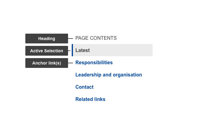
The in-page navigation is a vertical menu containing (anchored) links to H2-headings on long content pages. It gives the user an overview of the page contents and has a fixed position (does not move while scrolling) at either the left side of a page on desktop or top-bar on mobile. This component helps users scan of the page quickly contents and may potentially reduce vertical scrolling, allowing users to easily jump straight to the segment of the page.
Anatomy

- Mandatory
- Optional
| Elements | Mandatory desktop | Mandatory mobile | Description |
|---|---|---|---|
| Heading | yes | no | The heading of the in-page navigation - Default: PAGE CONTENTS (all upper case text) |
| Active selection | yes | yes | Indicator of the current segment of content |
| Anchor link(s) | yes | yes | Actionable element corresponding to the heading (H2) of segment of content - clicking it will jump to the H2 |
| Action indicator | no | yes | Varies depending on the state (collapsed/expanded). Indicates what the next action will do - displays content container on click |
| Content container | no | yes | This element displays relevant content in a container that's initially hidden |
Do's
- aim for short, distinct headings (H2) in order to improve scannability and reduce possible confusion
- make sure to order content logically so there is a natural progression when looking at the headings (H2) alone
Don'ts
- don't use long labels that break on the 2nd line (30 characters) unless necessary
When to use
- when you have more than one H2 on a page
When not to use
- don't use on a page without much content or a single H2
- don't use it to navigate beyond the page in question
Notes
Design
- current selection is indicated by a gray background color and a blue line on the left (border-left)